Safe Steps
A safety platform for every woman who's had to think twice about walking alone.
Safety
Social good
Role
Product Designer
Timeline
1 week
team
Solo - Research, UX & UI Design
platform
Mobile app
Introduction
"It was 9:45 PM. Aarti had just finished her class and was heading home. She messaged her mom, shared her location, and turned on her phone's flashlight, just in case. But what if the flashlight wasn't enough?"
This isn't fiction. For millions of women across Indian cities, this is every night.

01 - The Problem
A walk home shouldn't feel risky.
Walking home after a late class. Riding through an unfamiliar neighborhood at 11 PM. Waiting for an auto-rickshaw on a poorly lit street. For millions of women, students, and gig workers across Indian cities, these aren't dramatic scenarios. They're everyday reality.
Most safety tools fail at the moment they're needed most. They're slow to open, hard to use under stress, or simply untrustworthy.
02 - Research
Understanding how women actually navigate safety
To understand the real problem space, I conducted informal interviews with women across different age groups and daily routines. The goal was not to ask what safety apps they used, but to understand their actual behaviors when they felt unsafe in public.
Key patterns emerged consistently across conversations:
Staying on a phone call while walking, even when unnecessary
Pretending to be on a call as a deterrent
Sharing live location over WhatsApp with a trusted contact
Texting family members a route and estimated arrival time before leaving
The finding that reframed everything: not a single person mentioned opening a dedicated safety app. The tools people relied on were the ones already embedded in their daily habits.
This pointed to a fundamental gap in existing safety products. The problem was not a lack of features. It was that these tools demanded too much cognitive load at exactly the moment when a person's mind is already in threat-response mode. Finding the app, opening it, navigating to the right screen, none of that is realistic when you are frightened.
The app has to be faster than fear.
03 - Understanding Real Lives
Who we were designing for
Aarti, 22 - Student Aarti takes evening classes and often walks home alone after dark. She knows her route well but that familiarity does not make her feel safe. She keeps her phone out, stays on calls she does not need, and messages her mom every time she leaves campus. Safety for Aarti is not about emergencies. It is about the low-level anxiety that never fully goes away.
"I pretend to talk on the phone to feel safer. That's not real safety."

04 - Design Principles
What every decision was built around
Speed over everything - Emergency features reachable in one action, not three screens deep.
Trust in darkness - High contrast, minimal text, no jargon. Works when hands are shaking.
Familiar, not foreign - Phone number and OTP. The same pattern every Indian user knows from UPI and food delivery apps.
Empathy first - Emotional context set before a single feature is shown.
05 - Design Decisions
Why, not just what


06 - Honest Gaps
What I would improve in the next iteration:
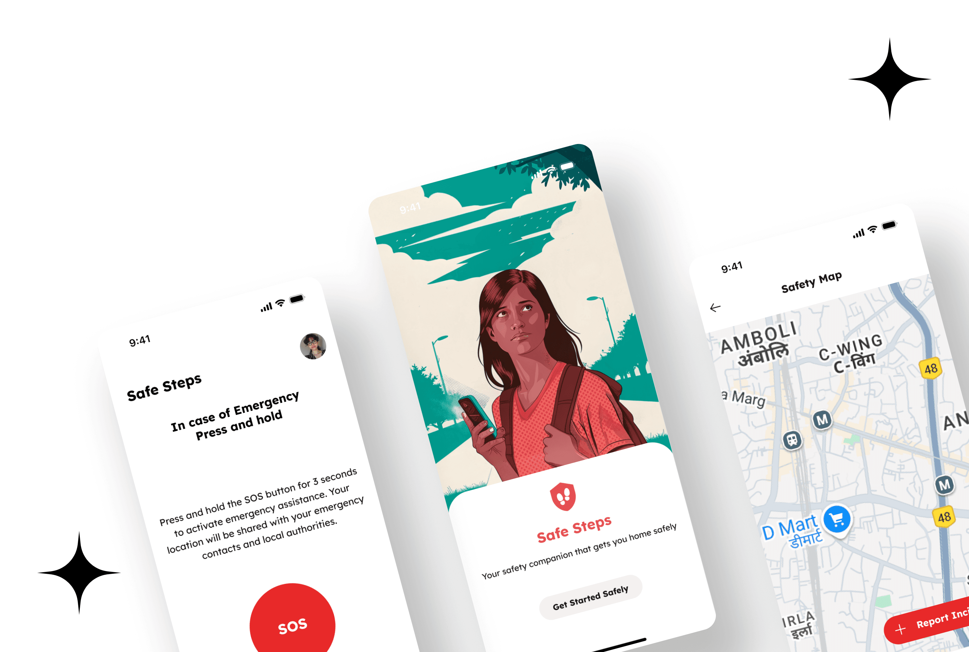
The route screen currently shows time estimates but not visual safety differentiation between routes.
Color coding or a safety score per route would make this more meaningful. The map does not yet render the heatmap overlay from reported incidents, which is the feature that most differentiates SafeSteps from simply opening Google Maps. These are the two highest-priority improvements.
07 - Reflection
Designing SafeSteps taught me something specific about high-stakes moments: the interface disappears when someone is scared. They do not read labels. They do not explore. They act on muscle memory and visual hierarchy alone.
Every decision kept coming back to one question: can someone use this with shaking hands and a racing heart? That question changed how I thought about button size, instruction length, and the number of steps in every flow.